Learn How to Easily Design a Professional Logo with Vector Ink
In this video tutorial, we demonstrate how to create an "SJ" logo using Vector Ink's outline text feature combined with the Path Builder tool. You'll learn step-by-step how to transform simple text into a sleek, customized logo that reflects your brand's unique identity.
Watch the video embedded in this post to see the logo design process in action. This tutorial will equip you with the knowledge to use Vector Ink effectively, making it easy to start designing your own logos without the complexities of traditional desktop software.
The Importance of Logo Design
Logo design is a critical element of branding, often serving as the first impression of a business. A well-crafted logo can foster trust, communicate brand values, and ensure memorable brand recognition. This article explores the significance of vector logo design, its benefits, and guides you on starting your logo design journey.
A compelling logo design plays a vital role in brand recognition and customer recall. It conveys your brand's message succinctly and effectively, which is essential for connecting with your target audience. Moreover, a professional logo enhances your brand's credibility, signaling quality and attention to detail.
Advantages of Vector Logos
Vector logos offer unparalleled advantages due to their scalability and editability. These logos retain their quality across various media types and sizes, from tiny mobile screens to large billboards, without any loss of fidelity. Additionally, vector logos are easily editable, allowing for adjustments as your brand evolves, and are optimal for both digital and print formats.
Choosing the Right Software for Logo Design
While several software options like Adobe Illustrator and Corel Draw are available for vector design, they often come with a steep learning curve and are packed with more features than necessary for logo design. For this tutorial, we'll use Vector Ink—a streamlined, browser-based SVG editor designed specifically for logo creation. Vector Ink stands out by providing high-end tools tailored for logo design, accessible through a simple, user-friendly interface suitable for designers of all skill levels. It's perfect for creating professional logos directly from your web browser on any device, with the added convenience of cloud storage to access your projects anywhere.
Embark on your logo design journey with Vector Ink and discover the simplicity and power of designing directly in your browser. Whether you're on a phone, tablet, or desktop, Vector Ink's responsive interface ensures a smooth design experience, allowing you to create stunning logos that elevate your brand.
Vector Ink is renowned for its intuitive design, robust feature set, and seamless cloud integration, making it a top choice for designers looking to streamline their SVG creation process. In this video tutorial, we delve into 10 essential tips and tricks that will enhance your productivity and creativity within Vector Ink.
Vector Ink is not just an SVG editor; it's a comprehensive suite packed with intuitive features unmatched by other vector design apps. Here's why it stands out as the best option for online SVG editing:
Vector Ink is not just an SVG editor; it's a comprehensive suite packed with intuitive features unmatched by other vector design apps. Here's why it stands out as the best option for online SVG editing:
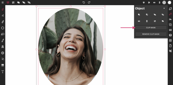
Masking images into any shape is easy and convenient with Vector Ink's online app. Image masking allows you to crop your image into a chosen shape, creating everything from single image edits to complex collages. Import your photos, add shapes, and crop the images into these shapes with a single click. The process is limitless, entirely free, and does not include watermarks.
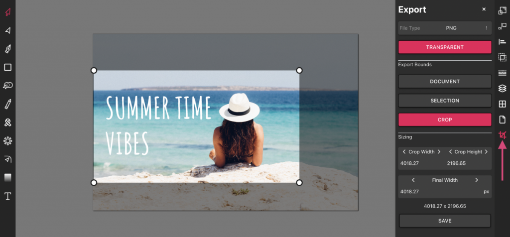
Vector Ink is more than just an online SVG editor; it's a versatile tool that anyone can use to make edits and export the results as SVG, JPG, or PNG for free. In this tutorial, we'll guide you through the process of importing a photo, adding text, and exporting your creation with Vector Ink. Adding text over an image is straightforward, providing a convenient online solution for anyone needing to enhance their photos.