🧱 Vector Ink Shape Tools & Icon Library Tour | Fast, Clean Design Essentials
Clean, consistent shapes are the foundation of strong vector design. In thi...
Shadows add instant depth, hierarchy, and polish to your vector designs. In this quick tutorial, you'll learn how to use Shadow Properties in Vector Ink to create subtle UI shadows, bold logo lighting, and everything in between. We'll cover enabling shadows, revealing opacity, positioning with the on-canvas control, and dialing in blur and color.
1) Select your object. Click any shape, logo element, or UI card you want to lift off the background.
2) Open the Shadow panel. It's in the control bar (on mobile, it appears at the bottom). Increase Shadow Blur to preview softness.
3) Reveal the shadow by setting opacity. If nothing appears yet, click the color icon inside the Shadow panel to open Shadow Color. Raise the alpha (opacity) slider below the color wheel until the shadow becomes visible. You can fine-tune the hue here (neutral grays are great for subtle UI; warmer hues can add stylized depth).
4) Position the shadow. Drag the pink circle control around your object to change the angle and distance of the shadow. Use shorter distances for soft, close contact shadows; longer distances for lifted elements.
5) Refine blur and intensity. Return to the main Shadow panel to adjust Blur (softness). For a crisp logo lockup, keep blur low; for UI elements or floating badges, increase blur and slightly lower opacity for realism.
6) Close the color dialog & keep tweaking. After setting alpha and color, close the Shadow Color panel to return to the Shadow panel for final adjustments while watching the live result.
That's it—clean, dimensional visuals in just a few clicks. Try different blur, angle, and opacity combinations to match your brand style or UI language. Subtlety goes a long way for a premium look.
Ready to add depth to your next design? Practice on a logo, badge, or button and compare before/after results.
Launch Vector Ink and experiment with Shadow Properties to make your artwork pop with professional polish!
Clean, consistent shapes are the foundation of strong vector design. In thi...

Take complete control of your outlines with the Stroke Properties Panel in ...
Typography can make or break a design — and Vector Ink gives you total fr...
Vector Ink’s Path Builder Tool lets you combine, cut, and create complete...
Vector Ink’s AI Image Generator lets you create logos, icons, illustratio...
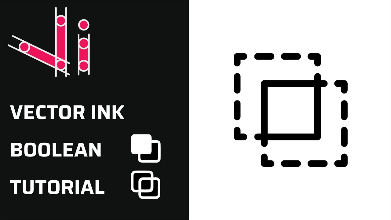
Boolean actions are the fastest way to build complex shapes from simple one...