
What Are UGC Ads? How to Create UGC Video Ads With AI
UGC ads look less like commercials and more like something a real person wo...
Every consistent brand you have ever seen — the same logo, the same two blues, the same rounded icon style, showing up identically on a website, a video intro, and a business card — is the result of a brand kit somebody built and everyone actually used. Without one, a brand drifts: the logo gets stretched slightly in every export, a new hire picks a color close enough, and a video team recreates a title card style from memory instead of a source file. This guide covers what a brand kit is, what belongs in one, a few real brand kit examples, and how a workflow like creative workflow automation speeds up building one without sacrificing consistency.
A brand kit is a single, organized package of a brand's core visual assets and the rules for using them: the logo in its approved variations, the color palette with exact values, the typography, and a small set of supporting graphics like icons or patterns. It is smaller and more practical than a full brand book — the point is not to document brand philosophy, it is to give anyone on a team, a freelancer, or a vendor everything they need to produce something on-brand without asking someone else to send files. A good brand kit answers "what logo file, what exact blue, what font" in under a minute.

The exact contents vary by team, but most working brand kits share the same core pieces:
These three terms get used loosely, but the scope differs. A brand kit is the files themselves — logo, colors, fonts, icons — ready to drop into a design or a slide. A brand style guide adds the rules for using those files: spacing, tone of voice, do-and-don't examples. A brand book is the full document, often dozens of pages, covering brand story and positioning alongside the visual rules. Most small and mid-size teams only need the brand kit and a short style guide; a full brand book is usually overkill outside a large organization aligning many departments or external agencies.
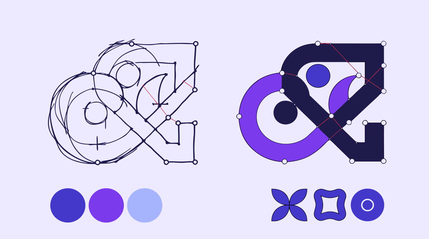
The strongest brand kit examples share the same trait: restraint. A tight color palette with exact values beats a mood-board's worth of "close enough" shades. A logo with two or three approved variations beats a folder of one-off edits made for specific projects. An icon set that visibly belongs to one family — same stroke, same corner radius, same level of detail — beats a pile of icons scraped from different free libraries. The common failure in weaker kits is not missing pieces, it is inconsistency between the pieces that are there: a logo in one blue and an icon set in a slightly different one, because nobody kept a single source file everyone pulled from.
AI tools help most in the two places brand kit work actually drags: generating first-pass icon and logo directions, and cleaning up source material that is not usable yet. Vector Ink's AI image generator can produce several icon or logomark directions in a shared style in minutes, and AI in-painting lets a designer swap one element — a background, a badge shape, a texture — without redrawing the whole set. Automatic vectorization turns a scanned sketch or a client JPG into clean, editable paths instead of a flat image that degrades on every resize. None of this replaces the judgment call of which mark represents the brand — it removes the hours of manual redrawing standing between a rough concept and a finished kit.
For source material that still needs cleanup, our guide to AI image upscaling and guide to vectorizing images cover exactly that prep work.
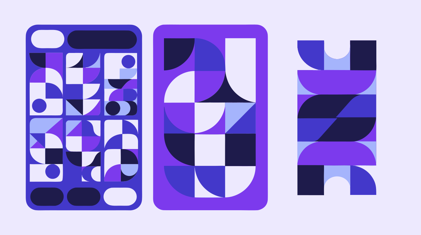
A brand kit does not stop being useful once the logo is designed — it keeps a brand consistent everywhere else. A web team pulls the exact hex values and icon set straight into a site build instead of eyeballing colors from a screenshot, which is one reason a clean brand kit makes the web design process move faster. A video or motion team uses the same logo files and color values for title cards, lower thirds, and channel branding, so a title sequence and a website header end up looking like the same brand instead of two different guesses at it. Treating the brand kit as a shared source of truth — not a one-time deliverable — is what keeps a content creation workflow consistent as more people touch it.
Vector Ink combines AI image generation, automatic vectorization, precise path editing, and AI in-painting in one browser tab, with SVG, PNG, and ICO export when an asset needs to leave the kit and land in a website build, a video project, or a slide deck. A logo concept, a matching icon set, and a color palette can all be built, refined, and exported from the same clean source files — no round-tripping a raster export between three different apps just to keep a brand kit consistent.
The Web Design Process · Building a Content Creation Workflow · Creative Workflow Automation
UGC ads look less like commercials and more like something a real person wo...
Every video that runs on schedule starts with the same unglamorous document...
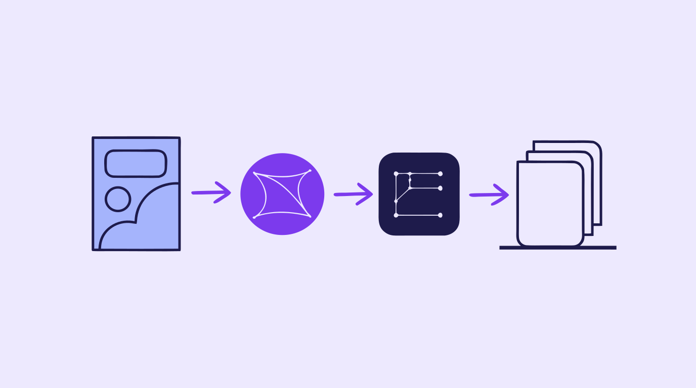
A content creation workflow is the thing standing between "we need graphics...
A storyboard used to mean an afternoon with a sketchpad, a shot list, and e...
Every design project starts with a question nobody wants to answer with wor...

Concept art is the visual thinking that happens before a final design, shot...